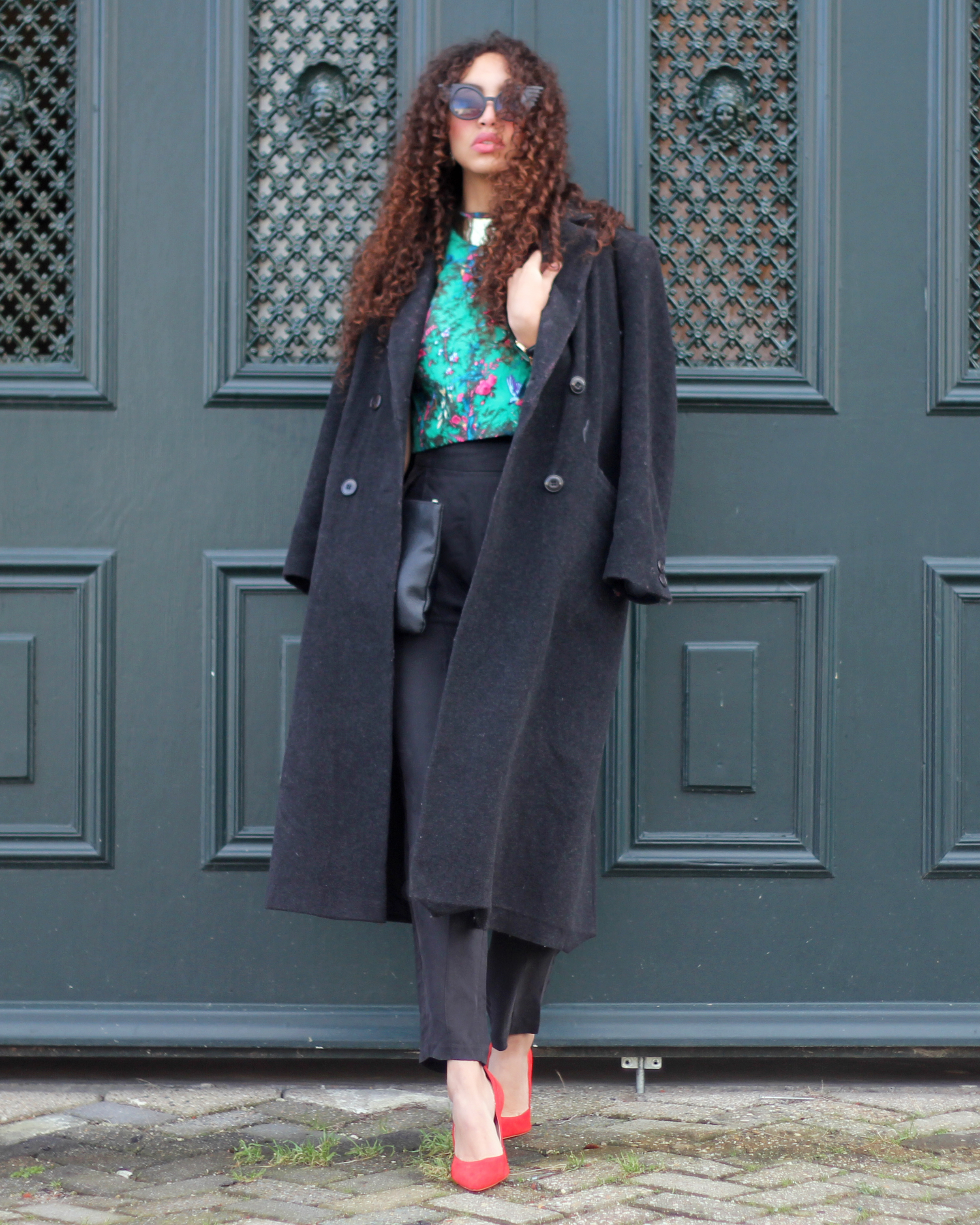
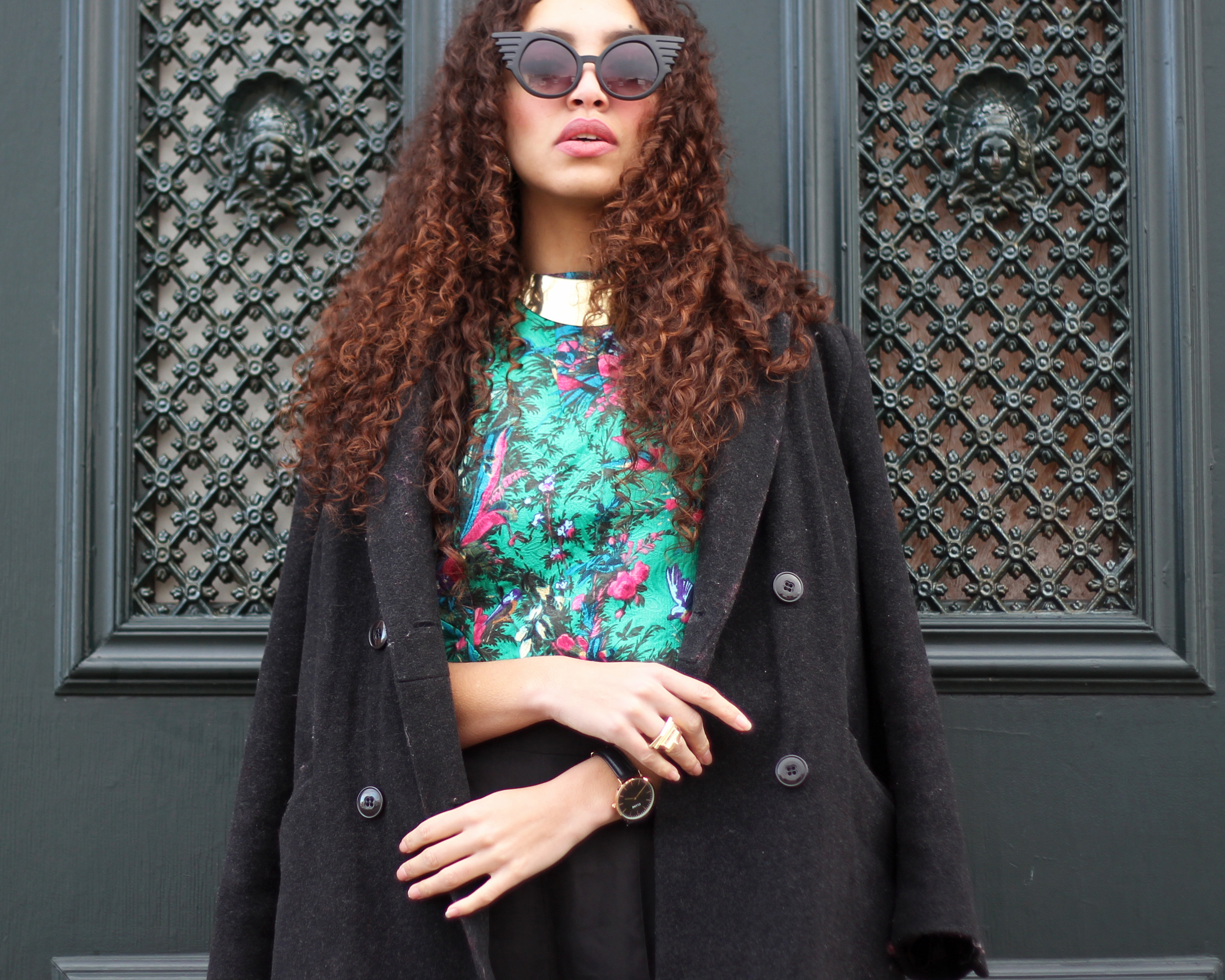
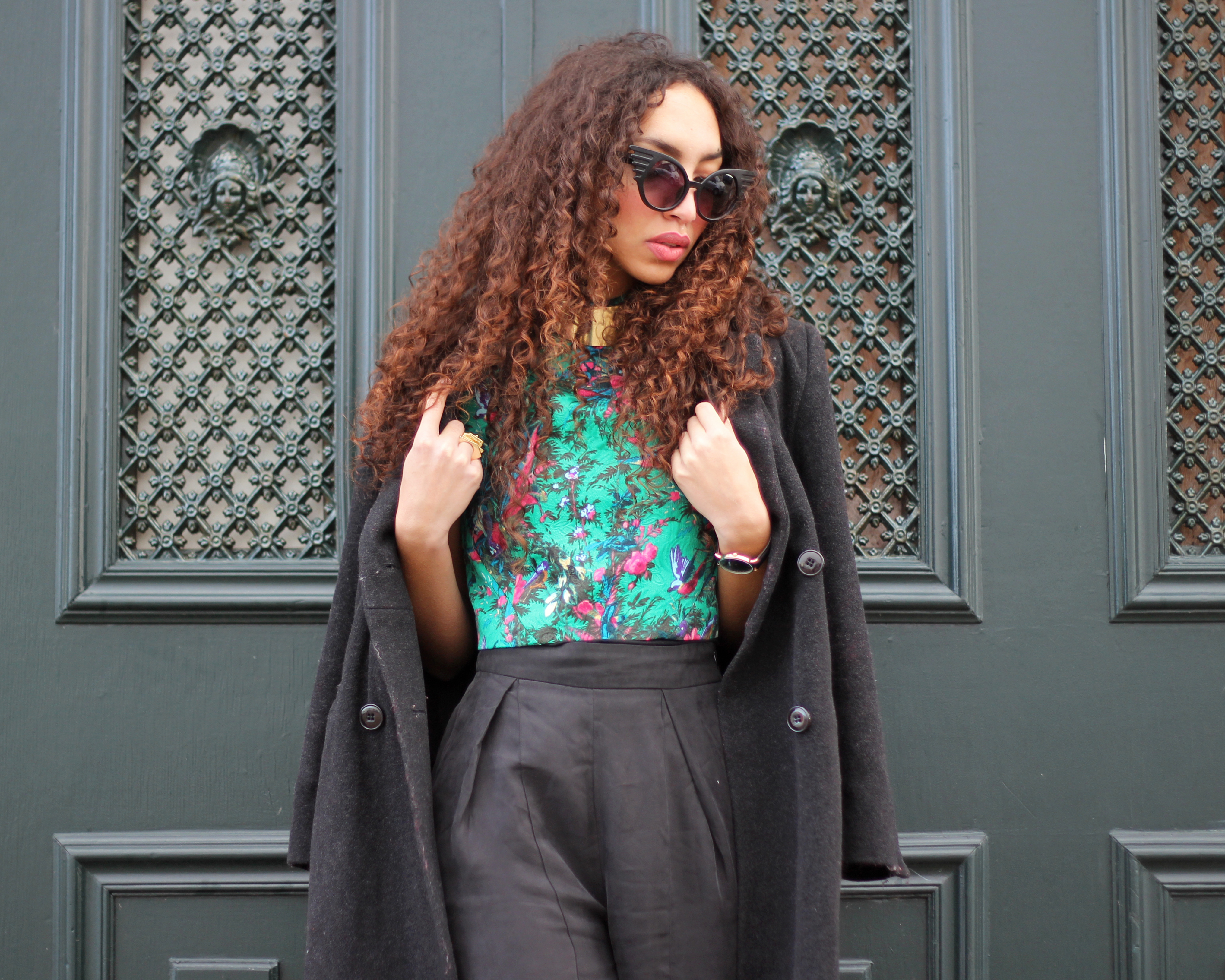
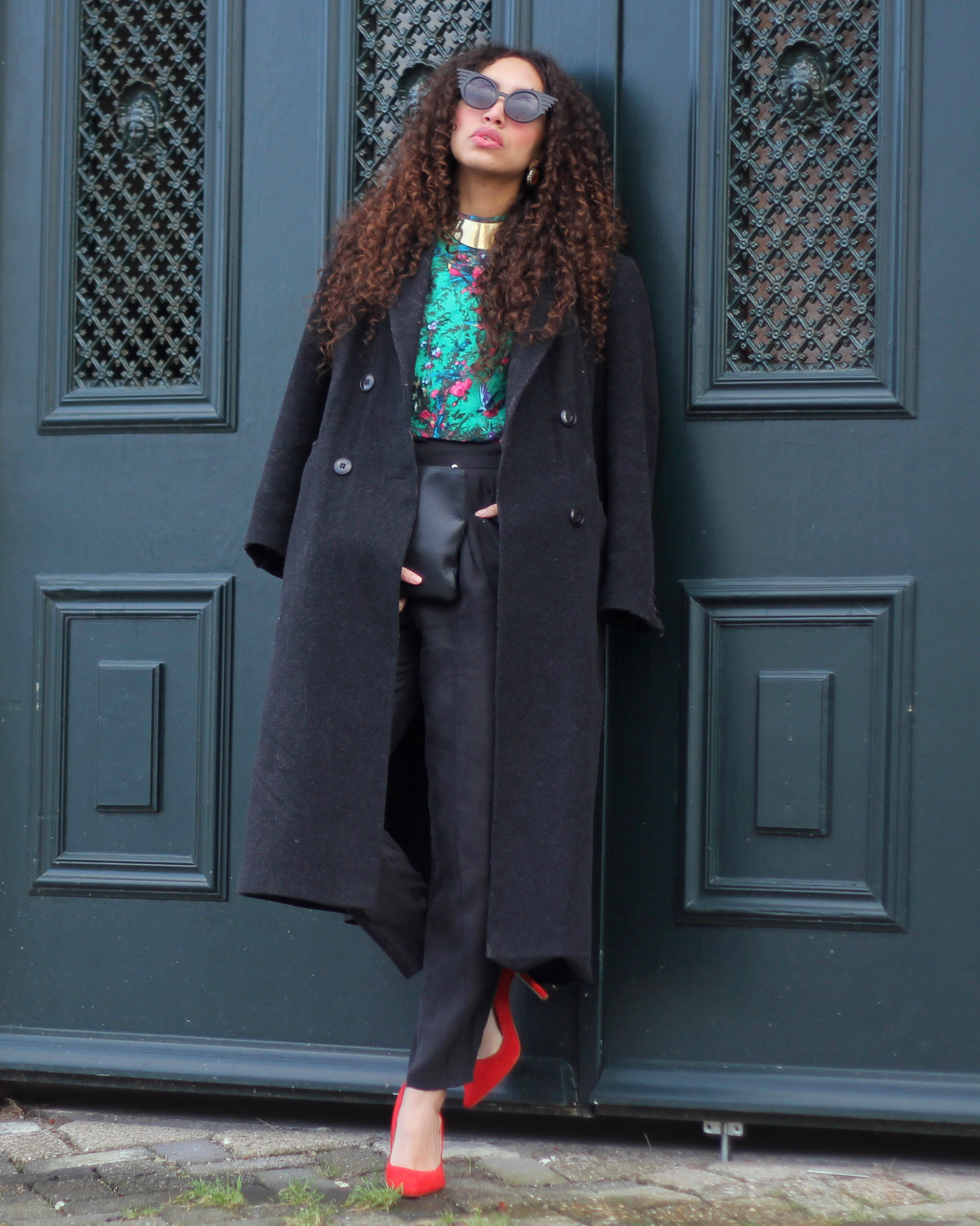
Bloom birds
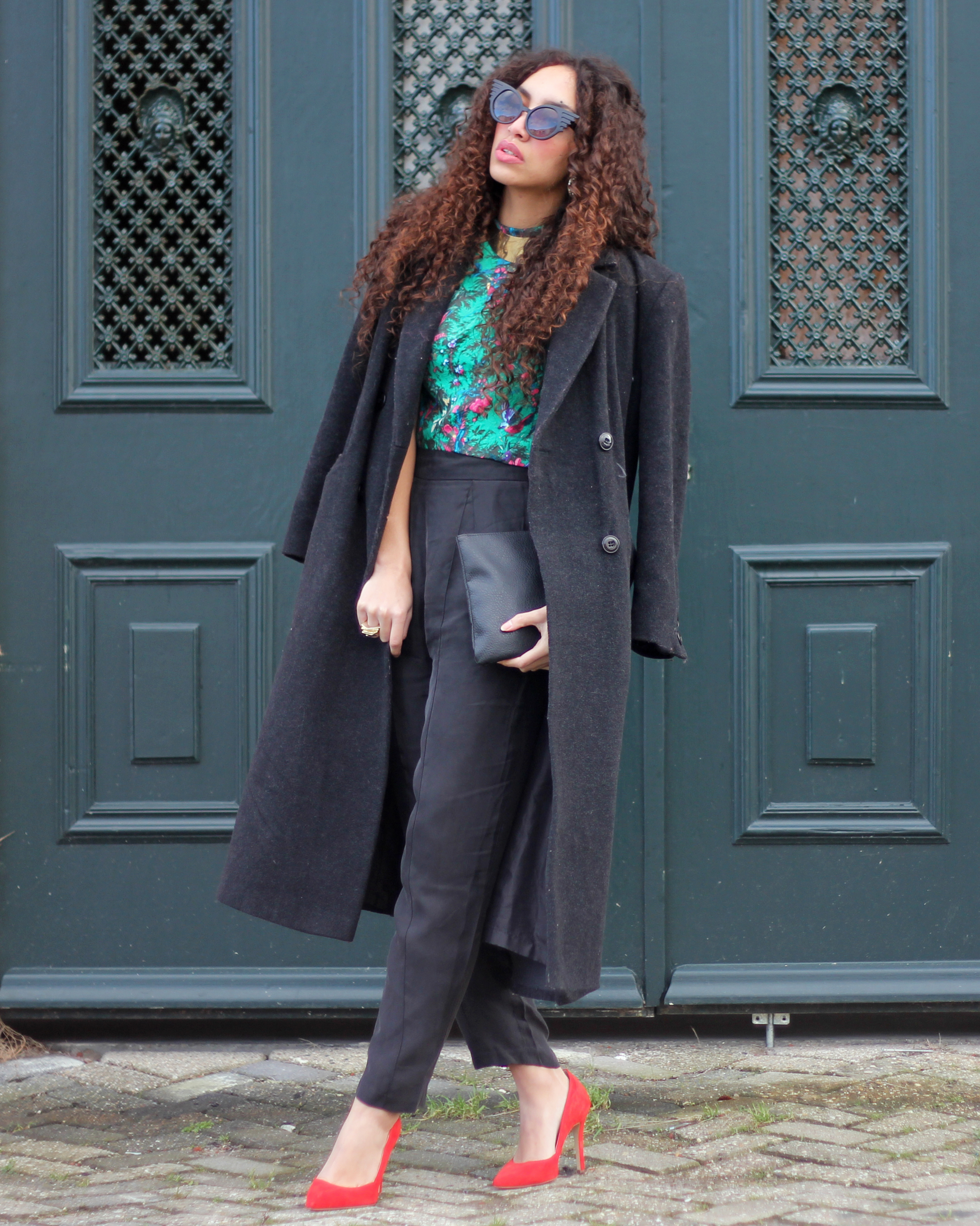
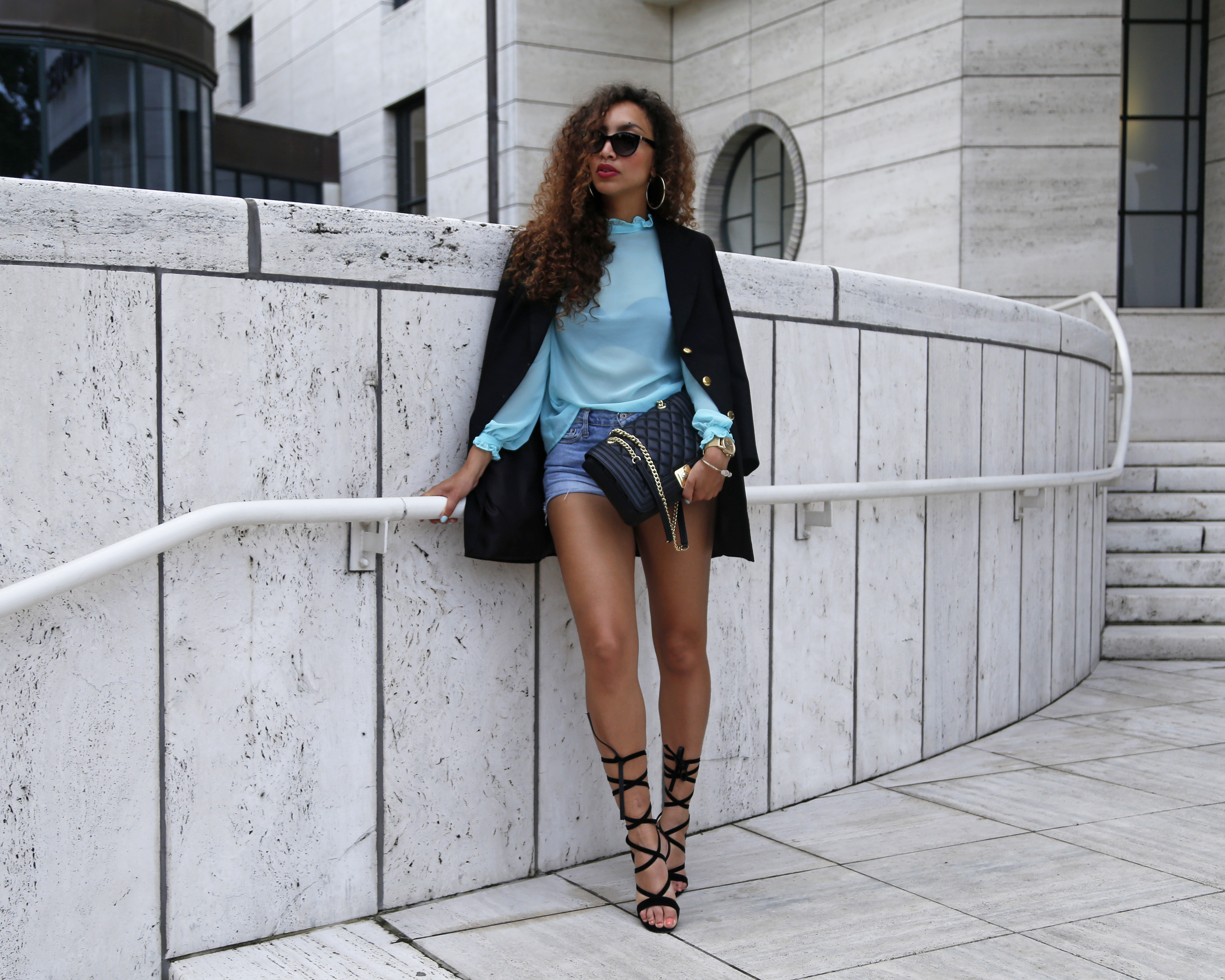
Flowers, tigers, birds and stars. They all make beautiful prints if it’s done the right way… Like in this top. The colors are contrasting and thus make a colorful and happy look, which is mostly what we would go for in a print, right?
If you’d take a brief look at my closet, you would see a lot of colors. Ranging from bright and popping to sober and soft. But when I think of myself and my style I wouldn’t say that I dress very colorful. And I think that that has everything to do with my styling.
I often choose to match colorful items to black or white and to match quirky prints to plain items, just like I did right here. I wanted the top to stand out from the rest, and moreover I wanted the outfit to look sophisticated in a happy way.
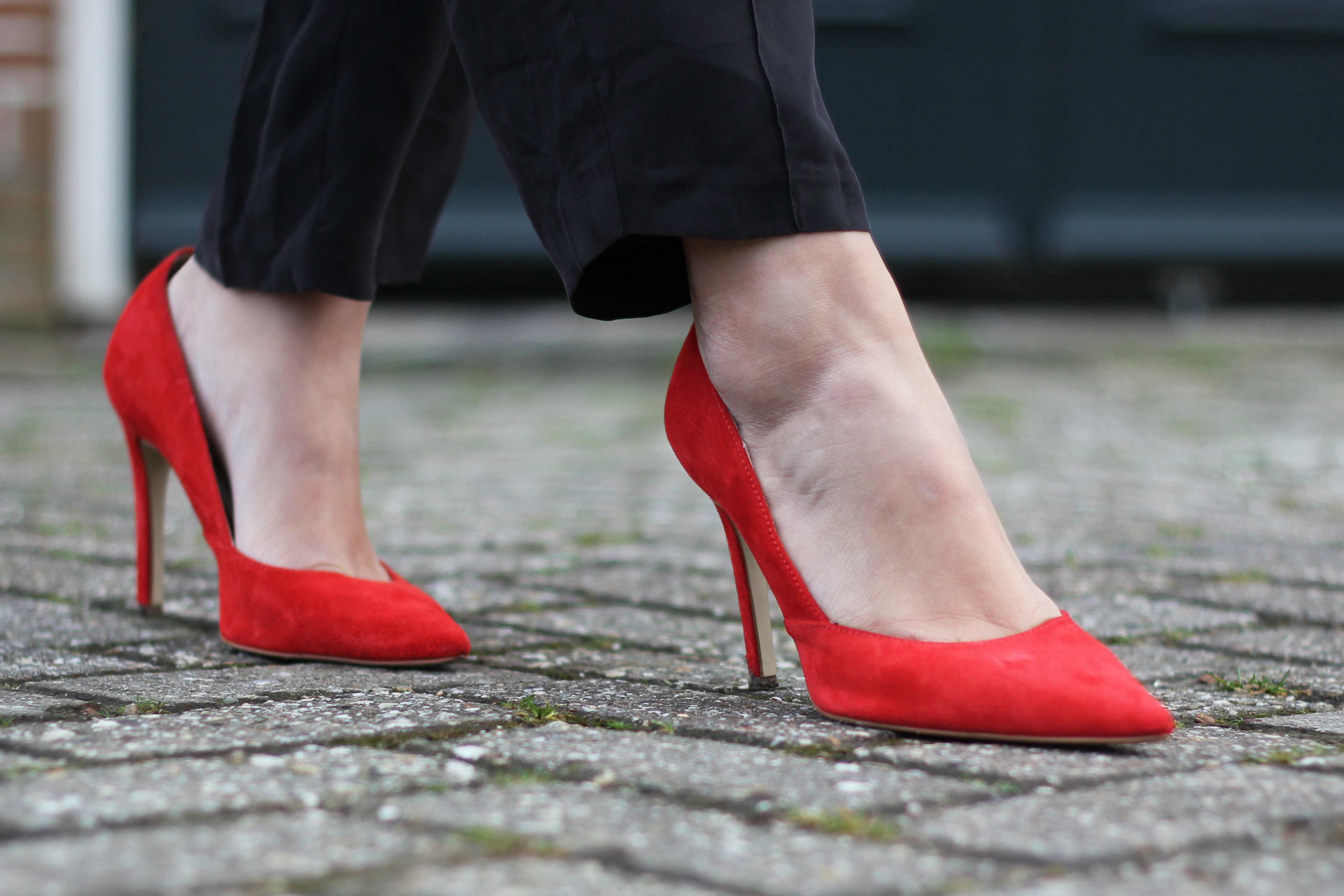
A funny detail about this look is that the orange of the shoes isn’t actually found in the print of the top. Normally, this would be a reason for me to reject the shoes from this outfit. I mean, the shoes should at least match with one color from the top, right? But I have found that when items are worn far from each other (for example, the top is above and the shoes are the lowest part of the outfit), it doesn’t really matter. In this case it even seems as though the deep red-ish orange of the shoes makes the pink birds pop out more.
What do you think of matching prints and bright colors?
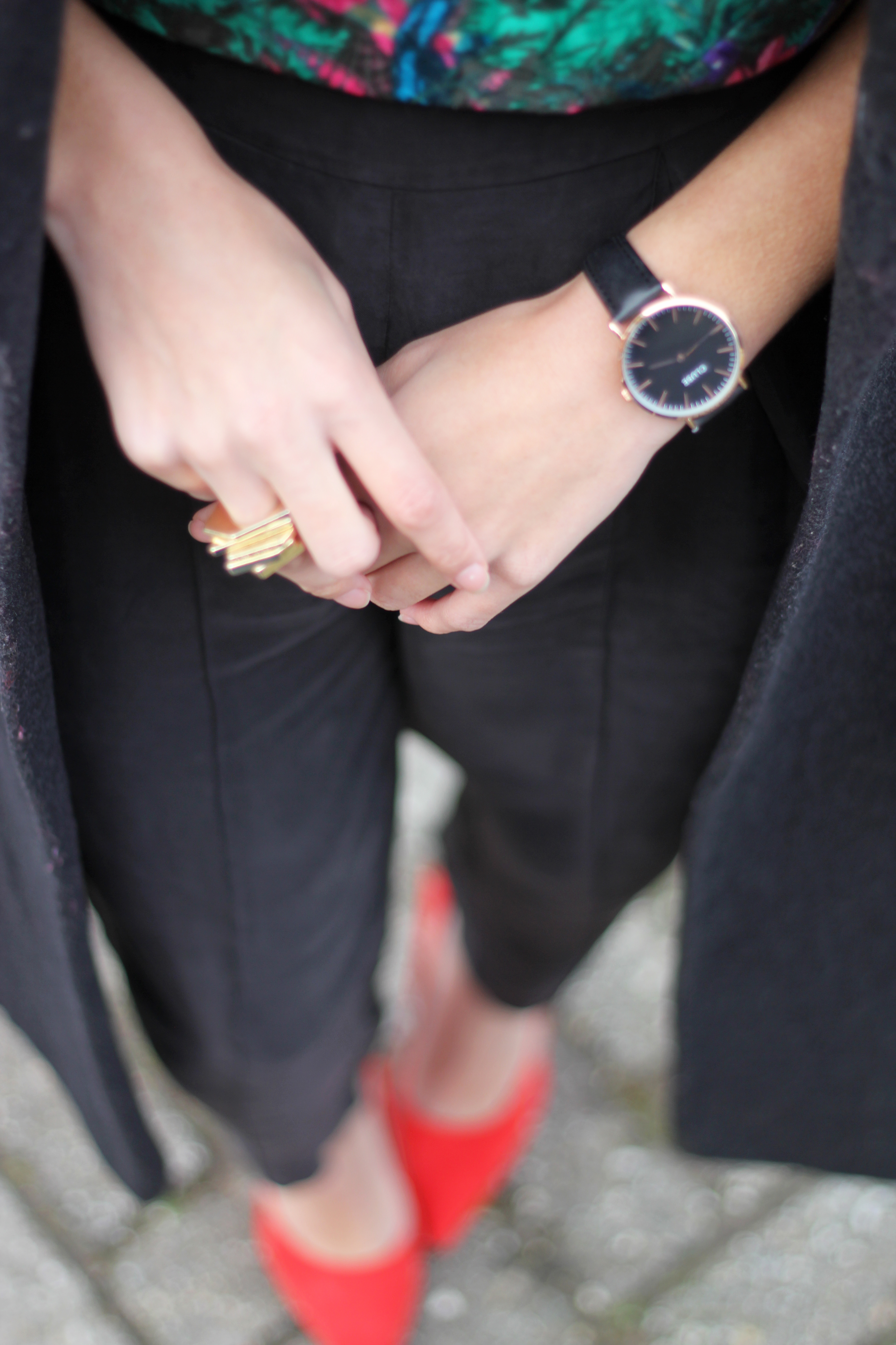
Wearing: Oasis top* / Front Row Shop pants* / Oasis heels* / Vintage coat / ZeroUV sunnies*
All items with * were gifted to me
[show_shopthepost_widget id=”552814″]
Dit vind je misschien ook leuk
THE BEST LOUNGEWEAR OUTFITS FOR SUMMER
HOW TO WEAR SHORTS AND LOOK SOPHISTICATED – PRT 2